Repositioning Kitchen Budapest
Branding and Visual Identity
Concept, design: Filip Ruisl
Project guidance: Kitchen Budapest
Finished: July 2017
After successfully finishing a residency program at Kitchen Budapest, I joined the core team as a multidisciplinary designer. My first design challenge was to create its new image along with a fresh and consistent visual identity.
What is Kitchen Budapest?
Kitchen Budapest is an Open Innovation Lab of T-Systems Hungary. It was founded in 2007 by a collective of media artists, theoreticians and coders from miscellaneous backgrounds. As one of the first media labs in Hungary, KiBu found its primary mission to instigate digital literacy and DIY techniques on the local scene. Ever since, KiBu has been actively present as an internationally recognized innovation lab with young researchers and developers forming its team.
KiBu incorporates three functions including research and development (prototyping, testing, service design, UX/UI design), education (next generation programs) and industry collaboration.
Why the repositioning?
For the past ten years, Kitchen Budapest used two different identities. Values they shared are the same as they are now – focus on innovation in technology, collaboration and a forward-thinking attitude. But their message was not clear and was not communicated properly. The lack of consistent branding has resulted in a confusing image, where people have seen KiBu as a closed, mysterious lab, full of people working on god-knows-what. And obviously, that was interfering with KiBu's mission and vision.
KiBu has always had a strong character. Its projects have resonated both home and abroad and also the team always consisted of smart people. The main goal of the new branding was to open KiBu up towards the public – to let our audiences know what we do on a daily basis, share our knowledge with them and engage them in participating.
Research
By the time I started working on the new identity, I was already familiar with the ecosystem KiBu operates in and the challenges it's facing. I started the research reading a lot of articles and other designers' case studies on how to approach the repositioning of a platform similar to ours. Afterwards, I wrote a textual analysis on how I will proceed.
I was absolutely aware, that we can't create just a new visual identity – we need to realign the communication and content strategies – what and how are we going to communicate with our audiences. The content needs to be backed by proper imagery and tone of voice. Otherwise, it just won't work and the whole process will render useless.
A couple of articles, that helped me to set up the project in the first phase:
Your style guide’s missing something — and it’s big by John Moore Williams
The Brand Identity Canvas by Jeff Whitlock
Identity Design by Erik Wagner
11 Tips to Help Improve Your Brand's Communication Strategy by Meaghan Moraes


New KiBu should:
Bridge.
Branding and identity allows to represent a welcoming, explanatory and caring approach to build a bridge between laymen and tech-specialists. It shouldn't represent an elitist, mystified or undecided attitude. It’s necessary to show people outside of KiBu what we do on a day-to-day basis.
Publish.
The repositioning of KiBu supports its role as a mentor in the tech circles. It is important to share our findings on topics related to the ongoing research/projects in the form of branded case studies, explaining KiBu's approach and attitude. The tone of voice has to be welcoming and consistent across all the platforms we use for communication – both visually and in writing. Content drives the brand in this omnichannel era.
Reflect.
In the past ten years, KiBu has shapeshifted multiple times. It's been perceived as a makerspace accelerating startups and scaling innovative ideas towards global use in a wide range of industries. Although KiBu has always had a strong character, it’s never been portrayed as a strong brand. The lack of solid branding was responsible for KiBu's vague image – and that has to be avoided. The new KiBu will be seen as a strong player by proper and authentic communication.
Curious, but not immature. Wise.
Tech-oriented, but not mystic. Welcoming.
Visually strong, but not artsy. Balanced.
Experimental, but not chaotic. Playful.
Innovative, and always user-centered. Constructive.
Key values of repositioned Kitchen Budapest
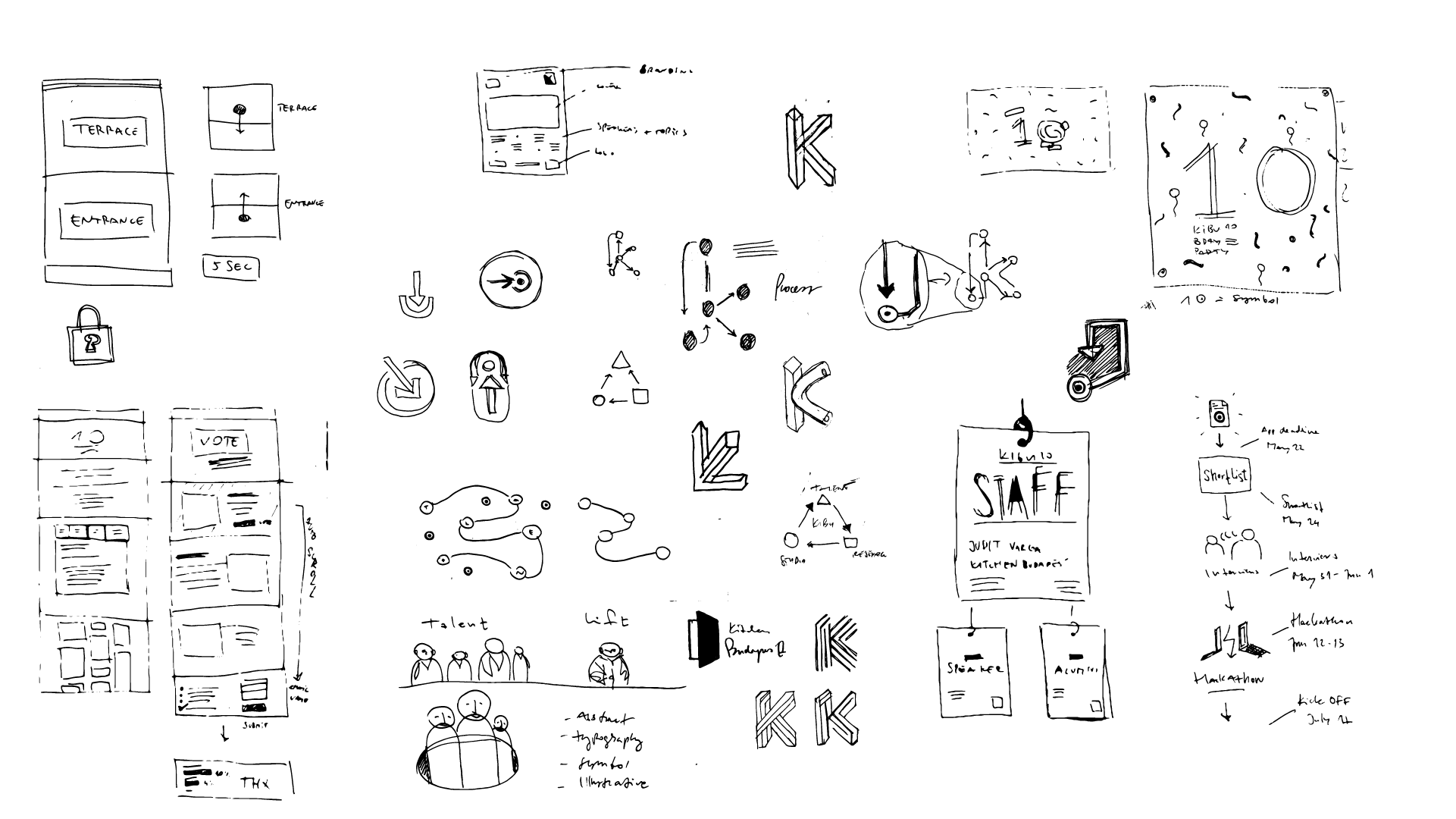
After the research phase, I started to collect and draw visual clues, that led me to a couple of logos and symbols. Among the sketches collected below, you can also find the first sketch of the concept I decided to develop further.

The Concept
The philosophy behind the new symbol is inspired by the Iterative Design methodology. Usually applied in UX / UI design process, this approach allows to identify any issues that arise before the design is put into wide use. When KiBu is developing or guiding the development of products (or services), multiple rounds of user interviews, testing, client consultations and design iteration are required.


Logotype and symbol
Two core elements of the visual identity are the logotype and the symbol of KiBu.
Animated version of the symbol by Gábor Pribék.
The symbol visualises the interconnection of KiBu's departments, their workflow and their cooperation. These procedures are crucial for successful internal and external project development. The symbol was created first and its elements were then visually abbreviated into the shorter logotype. Also, it's similar style to a PCB circuit pays a tribute to KiBu's tinkerers and hardware hackers, that were also present from the day one.
Graphical complexity of the symbol makes it hard to use in small scale. That's why the shorter logotype is the primary one.
Typography
I chose Grilli Type's Haptik typeface for this visual identity. It's quirky and playful, yet still clean and professional. It's very versatile – bold and very graphic when serving as a display typeface and easily readable when used in a paragraph. It has plenty of weights, so it's possible to create impactful graphics using typography.
On the web, Haptik is accompanied by a Google webfont Lora for better readability in larger paragraphs.


Screenshot from our internal presentation when I was announcing the new identity to the core team. You may notice there were different colors in the game back then – now I can say I'm glad I didn't use those.
Colors
After trying a lot of color combinations, I've settled with green, orange and cyan. They fit well with the desired image – energetic (orange), friendly (green) and professional (cyan).
I like the way Material colors are designed – they are versatile and easy to work with. We use them as a hint also across presentations, where we don't want to be limited by our tricolor – tints of each Material Color color keep the structure of the media consistent, yet still keeping the hierarchy or depth.


Digital media
One of the core tasks was to create a new, functional and modern website. Focus was on simplicity and easy navigation. Also, we wanted to emphasize the projects we do, so the Projects page has more complex filter / search built in.
Click the image to go to view the live version.
Kitchen Budapest Stories is a Medium publication aggregating stories on topics from our research, talent or studio members. Posting relevant information on topics of ongoing research, projects and problems of technology we're adapting is a form of broadcasting our approach to these issues in a form of non-periodical journal, reflecting our current occupations.


KiBu Sesame – the app that opens the entrance / terrace door on the office. App color scheme is randomized on launch.
Business Cards, Merch
I believe that business cards are a crucial part of every brand. They're the first impression you make with a potential client or partner, so they have to be solid, and have a certain weight. I wanted them to feel professional, yet still friendly and not overly confident.
They are printed black and white, although they have a little touch – the symbol on the front page is printed with letterpress and each person has three types of colored edges. They are pretty thick; when you hand a card to someone, it feels almost like a branded piece of merchandise.
We also made a series of Tote bags, where the detail of the KiBu symbol is used as a main element. This detail is also used as an avatar we use in our digital communication and as a profile picture on social media.


Light Cubes
Organising events is one of the key activities of Kitchen Budapest. Usually, these events have been branded using various roll-ups, banners and other ordinary elements. Instead of using a common medium with a new design for this purpose, I've decided to create a custom solution – a backlit cube with different infomation on it's sides.
These cubes can be easily transported, are modular (can be used as a stand, platform, navigation mark, decoration) and also stackable. Each cube is made of glossy plexiglass and is lit from within with RGB LED's, meaning they can be almost any color. And they can be used in the dark as well.


KiBu10!
Parallel to the development of KiBu's identity, my task was also to create and design the visual identity of KiBu10! – tenth anniversary of Kitchen Budapest in June 2017.


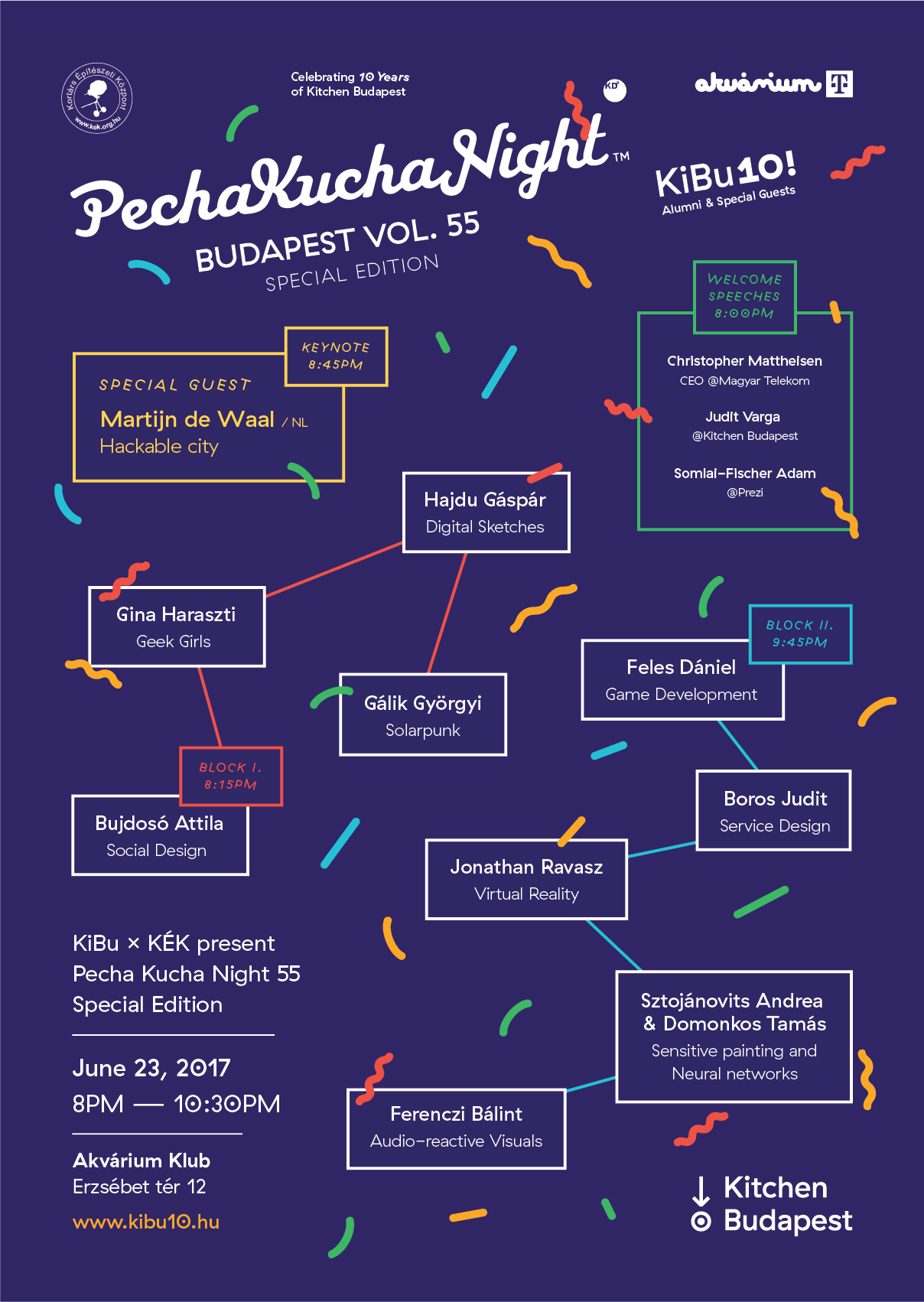


KiBu10! A2 Posters for each event.
KiBu10! was a series of events. We started in the headquarters of Magyar Telekom, where we installed our special project we chose to develop as our present to our circles – Training 2038.
T2038 is an interactive VR installation, where the user is engaged in a dialogue with an AI entity. Together they discuss underlying principles of human and artificial symbiosis. By interacting with the entity in VR, users get real-time data related to questions they answer – they can see how many previous users agreed or disagreed with their opinion. The installation was then exhibited in Telekom HQ, inside our studio during the Demo Day, and also on the closing Partynight in Akvárium Klub. Training 2038 was also exhibited on Ars Electronica in September 2017.


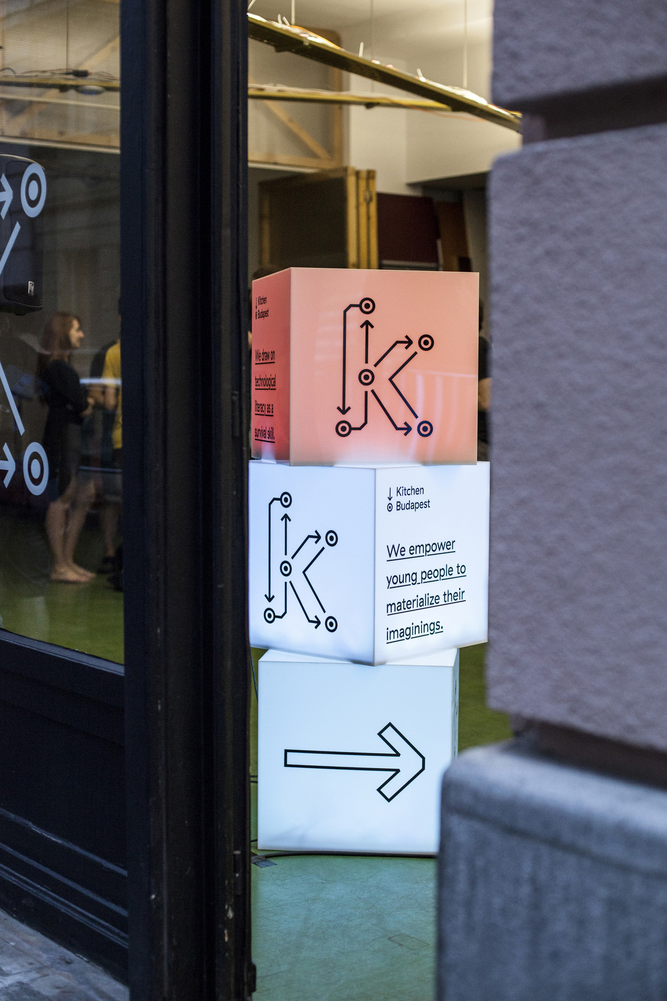


Photos from KiBu10! - see more at the KiBu Flickr profile.
Summary
A rebranding is always a process that requires a lot of time, lot of trial-and-error, a lot of variations in design and a lot of decisions to make. One of the most important things I assured myself in was that if you spend enough time researching and sketching, you're going to come up with a consistent, bulletproof design that works across all the channels you are using. And of course you will save a ton of time and a lot of headaches during the design process itself.
Huge thanks to Grilli Type for featuring the KiBu Identity on their website!
If you want to know more about KiBu accelerator programs and a lot more, visit:
kitchenbudapest.hu
fb.com/kitchenbudapest
twitter.com/kibu
instagr.am/kitchen_budapest
medium.com/kitchen-budapest
soundcloud.com/kibucast


